When colour is in the way.
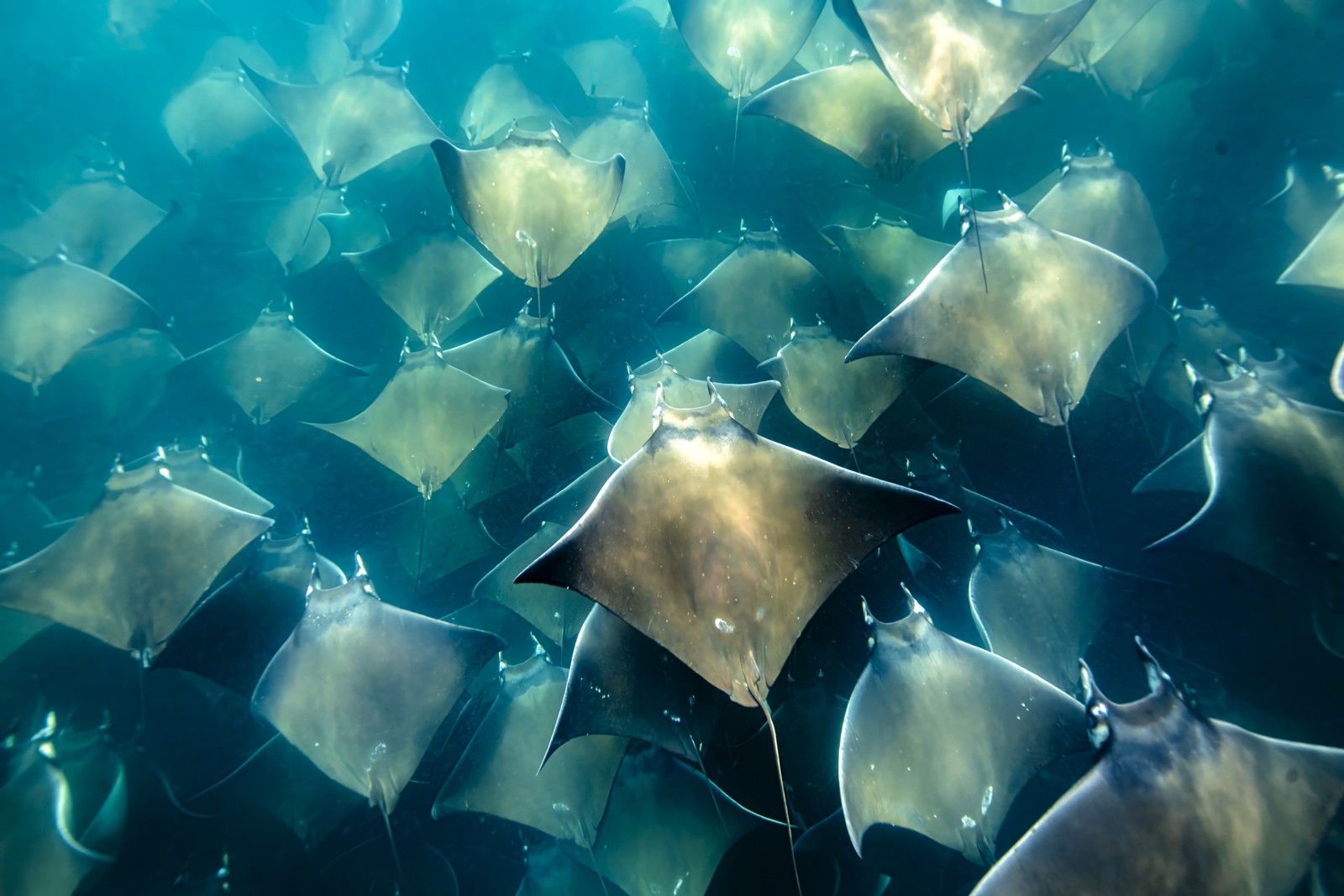
Strip the colour from this shoal and you don't lose the photograph. You finally see it.
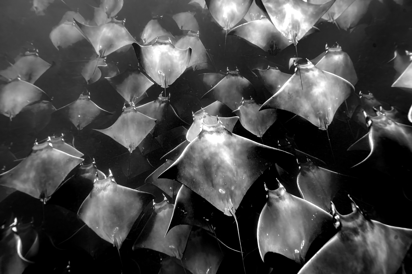
In colour, the eye drifts across teal water and gold bellies. But the picture was never about the colour — it was about the shapes: a hundred rays stacked into a single graphic rhythm. Black and white takes the distraction away and hands you the form, the tone, the pattern. The catch is that black and white isn't "remove the colour" — it's a conversion.
From colour to conversion.
Same frame. Only the treatment moves.
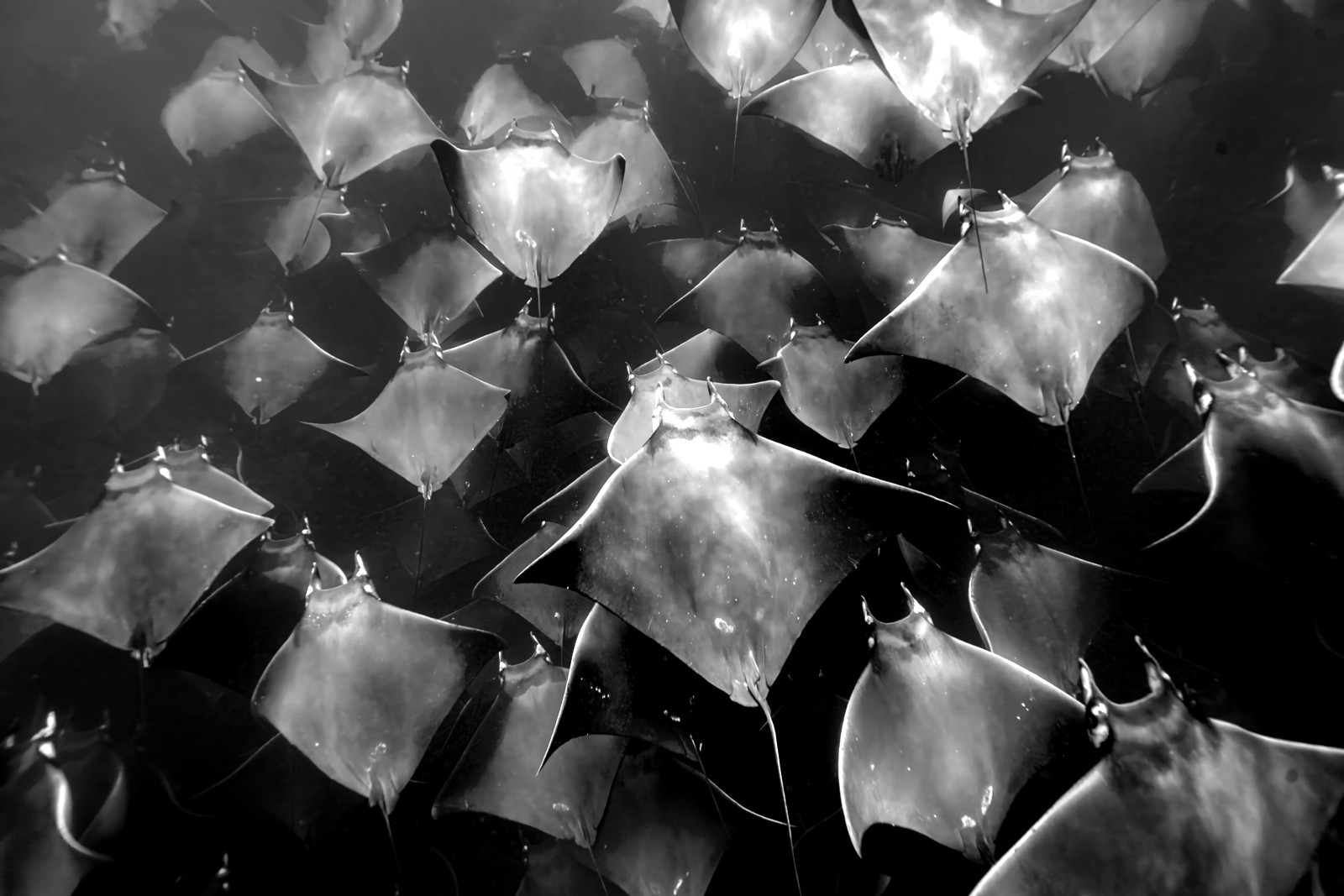
This is it. A real conversion separates the tones — dark rays against bright — and the whole shoal snaps into a rhythm of shapes.
Convert, don't desaturate
Pulling saturation to zero gives you one flat grey. A conversion decides how each colour becomes a tone — so things that were different colours stay different greys.
Go mono when form is the story
Reach for black and white when the picture is about shape, tone, texture or gesture — and the colour is just along for the ride.
Protect the mid-tones
The pattern lives in the greys between black and white. Crush them for contrast and you throw away the very thing you converted to see.
Colour, or the shapes.
Tap to put the colour back.
"Colour shows you what was there. Black and white shows you what it was about."
Read the conversion.
Tap each mark.
Ask what the picture is about.
- Open a frame where the colour is pleasant but the picture is really about shape, tone or texture.
- Convert it — don't just desaturate. Adjust how each colour maps to a grey until the subject separates from its background.
- Add contrast only until the form reads; stop before the mid-tones crush.
- Put the two side by side, and keep the one that's about the right thing.
If the colour was pretty but the mono was clearer — the colour was in the way all along.